
Feature Adoption Tracking: What Most Teams Get Wrong
Most SaaS teams track feature adoption wrong. Learn the critical mistakes in product analytics instrumentation and how to fix them for accurate insights.
Introduction
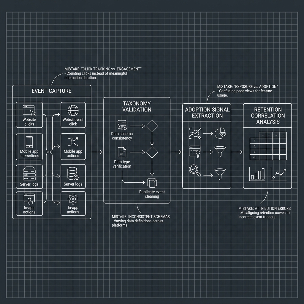
Feature adoption tracking is where product analytics should shine, yet it is the exact discipline where most SaaS teams produce the worst data. The problem is not a lack of tools. Teams instrument events, build dashboards, and still end up unable to answer the most basic question: which features actually drive retention? The root cause is a set of recurring mistakes in how adoption is defined, measured, and connected to business outcomes. Conflating a button click with meaningful engagement, shipping events without taxonomy governance, and ignoring cohort-level analysis are all patterns that quietly erode the reliability of every downstream decision.
Key Takeaway: Most feature adoption failures stem from three fixable errors: tracking surface-level interactions instead of meaningful engagement, lacking a governed event taxonomy, and never connecting adoption signals to retention or revenue outcomes.

Where Feature Adoption Tracking Breaks Down
The biggest issue is not that teams skip tracking altogether. Most product teams have some version of event tracking software in place. The problem is that their instrumentation reflects how the product was built, not how users experience value. This misalignment introduces silent errors that compound over time, making product metrics tracking unreliable at scale.
Tracking Clicks Instead of Meaningful Engagement
The most common mistake is equating a click or page view with adoption. A user opening a reporting dashboard is not the same as a user building a saved report and returning to it weekly. When teams default to tracking surface-level interactions, they inflate product usage analytics with noise. Meaningful engagement requires defining what "adopted" actually means for each feature, then instrumenting events that capture that threshold. Here is what separating exposure from adoption looks like in practice:
Exposure: user saw the feature in the UI or received a tooltip prompt
Activation: user completed the core action the feature is designed for at least once
Adoption: user repeated the core action across multiple sessions within a defined window
Retention signal: user continued engaging with the feature beyond the first 14 or 30 days
Depth: user leveraged advanced capabilities within the feature, such as filters, exports, or integrations
Conflating Exposure With Adoption
This is a subtler version of the click-tracking mistake, and it deserves its own callout. Many teams report "feature adoption rate" as the percentage of users who saw or opened a feature. That number tells you nothing about whether the feature delivered value. Discoverability and findability in UX: measuring discoverability and value perception separately is essential because a feature can have 80% exposure and 5% real adoption, which signals a design or value problem, not a distribution problem. True adoption starts at the point where a user behavior analytics signal confirms repeated, intentional use.

Instrumentation and Interpretation Failures
Even teams that define adoption correctly often fail at the instrumentation layer. Bad event taxonomy, missing properties, and disconnected data pipelines make it impossible to segment adoption data in ways that are actually useful for product managers or growth operators.
Event Taxonomy Gaps That Silently Corrupt Your Data
Without a governed naming convention, event data drifts. One engineer logs "report_created," another logs "create_report," and a third logs "reports.new." All three describe the same user action but fragment your analysis across three event names. The table below compares what happens when teams operate without taxonomy governance versus with a structured approach.
Dimension | Without Taxonomy Governance | With Taxonomy Governance |
|---|---|---|
Event naming | Inconsistent, per-developer conventions | Standardized verb_noun format across all teams |
Property completeness | Missing context (no plan tier, no feature area) | Required properties enforced via schema validation |
Cross-team alignment | Product, engineering, and analytics define events differently | Shared tracking plan reviewed before each release |
Data quality over time | Degrades with every sprint as new events ship ungoverned | Remains stable through CI/CD tracking audits |
Adoption metric reliability | Low; requires manual cleanup before any analysis | High; dashboards reflect accurate adoption signals |
The takeaway is straightforward: a well-structured event taxonomy is not optional overhead. It is the foundation that determines whether your product intelligence platform produces signal or noise. Teams that skip this step spend more time cleaning data than analyzing it.
Failing to Connect Adoption to Retention
The final and most damaging mistake is treating feature adoption as an isolated metric. Knowing that 40% of users adopted your new workflow builder means nothing if you cannot answer whether those users retained at a higher rate than non-adopters. This is where cohort analysis becomes non-negotiable. Segmenting users into cohorts based on which features they adopted, then comparing 30-day, 60-day, and 90-day retention curves, reveals which features are genuinely sticky and which ones create initial excitement that fades.
Without this connection, product teams end up investing roadmap resources into features that look popular 5% increase in customer retention can boost profits by 25 to 95 percent but contribute nothing to long-term retention. A retention analytics platform that surfaces these correlations automatically gives product managers the ability to distinguish engagement depth from engagement frequency, which are two very different signals. The features that reduce churn are rarely the ones with the highest raw usage counts. They are the ones where adopted users show measurably different retention behavior.
Conclusion
Getting feature adoption tracking right requires three things: defining adoption as repeated, meaningful engagement rather than a single click; enforcing a governed event taxonomy so your data stays clean across sprints; and always tying adoption metrics to retention outcomes at the cohort level. These are not advanced practices reserved for mature data teams. They are baseline requirements for any SaaS company that wants product-led growth metrics that actually predict revenue. TrackRaptor covers these disciplines in depth because the gap between teams that track correctly and teams that track at all is where most product decisions go wrong. Fix the instrumentation, connect it to retention, and let the data tell you which features matter.
Frequently Asked Questions (FAQs)
What is product analytics?
Product analytics is the practice of collecting, measuring, and interpreting user interaction data within a software product to understand behavior patterns, optimize experiences, and inform roadmap decisions.
How to measure product adoption?
Measure product adoption by defining a meaningful engagement threshold for each feature, tracking activation and repeated usage events within a set time window, then comparing adoption rates across user cohorts.
What is funnel analysis?
Funnel analysis is a method that maps the sequential steps users take toward a conversion goal, identifying where drop-offs occur so teams can target specific friction points.
How to track user behavior?
Track user behavior by instrumenting events at key interaction points using a governed taxonomy, enriching events with contextual properties like plan tier and session ID, then analyzing the data through segmentation and cohort tools that reveal patterns beyond raw counts.
What metrics should product analytics track?
Core metrics include feature activation rate, time-to-adopt, adoption depth, feature stickiness (DAU/MAU per feature), and the retention differential between adopters and non-adopters of each feature.
How does product analytics differ from Google Analytics?
Product analytics focuses on in-product user behavior at the individual and cohort level, while Google Analytics is primarily designed to measure website traffic acquisition, page-level engagement, and marketing attribution.
Is Mixpanel or Amplitude better for product managers?
Both platforms serve product managers well, but Amplitude tends to offer stronger behavioral cohort analysis out of the box while Mixpanel provides a more flexible event exploration interface, so the best choice depends on whether your team prioritizes pre-built behavioral insights or ad-hoc query flexibility.